
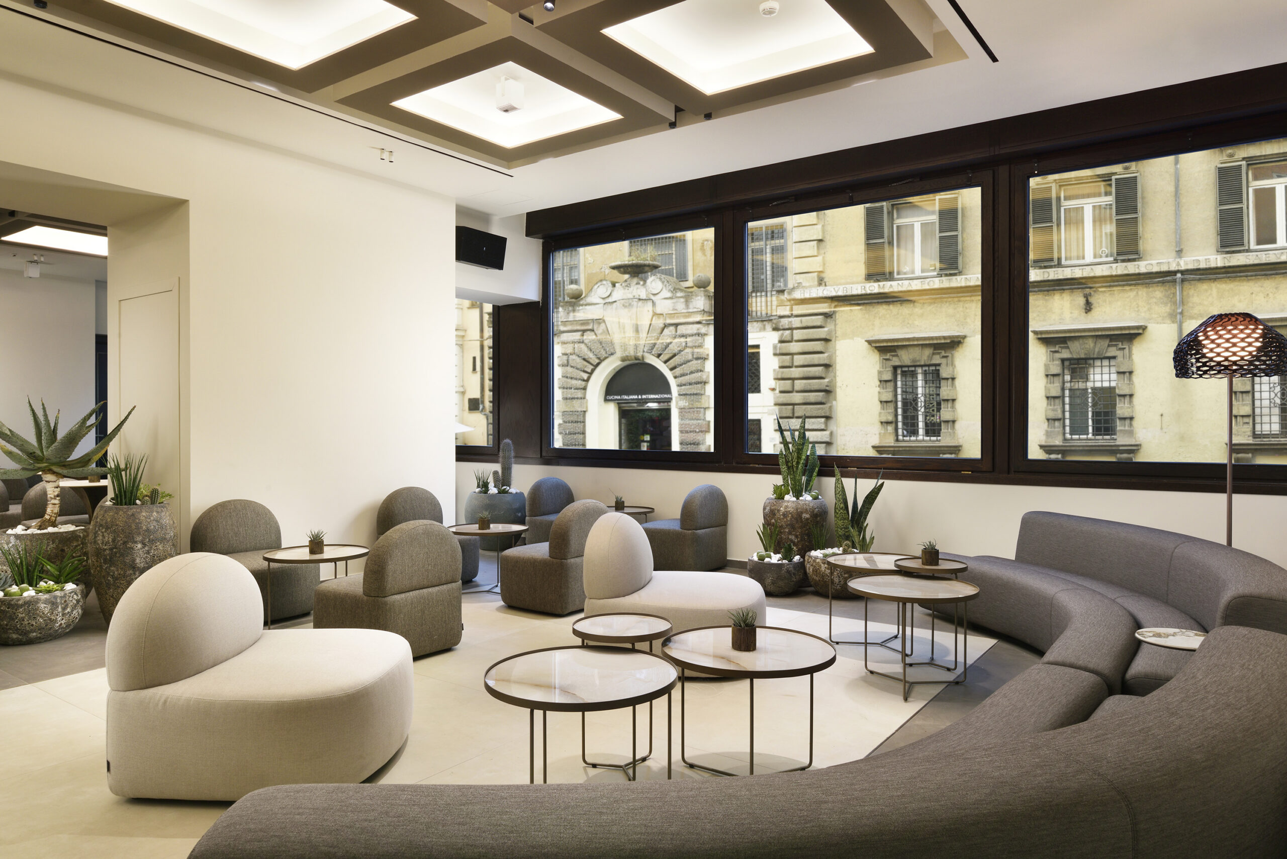
After seven decades of welcoming guests in Florence, Rome and Fiesole, FH55 Hotels, the Innocenti family’s hotel group, has unveiled a new identity. The rebrand is less about a logo than a statement of intent: one name that binds four very different addresses, and a definition of luxury built on warmth rather than display. It is also a useful lesson in how heritage houses stay relevant without giving up what made them worth visiting in the first place.
Seventy Years in the Making
FH55 Hotels has been in the business of Italian hospitality since 1955, when Dino Innocenti opened the Grand Hotel Mediterraneo in Florence. Seven decades and four properties later, the group has decided to take a clear look at itself. Its new brand identity follows its 70th anniversary year, and it is less a reinvention than a clarification. The aim is to say more plainly, and more consistently, what the family has been doing all along.
This is a family story first. The Grand Hotel Palatino followed in 1968, built a short walk from the Colosseum in Rome. Hotel Calzaiuoli, in the historic centre of Florence, opened as part of the group in 1982. After the founder’s death, his heirs, who own the properties today, kept expanding and acquired Hotel Villa Fiesole in 1995. Each addition brought a different personality, and that range is exactly what the new brand has been built to hold together.
One Name, Four Distinct Accents
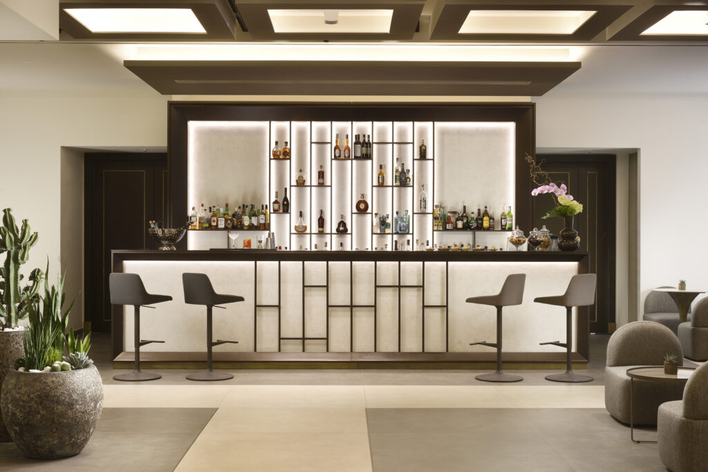
Any hotel group with strong individual properties runs into the same problem. It wants to be recognised as a whole without flattening the parts. FH55’s answer is to make its name the shared signature across all four hotels, while leaving each one free to speak in its own voice. Every property keeps an identity shaped by its destination, its character and the experience it offers, all within a common framework of values and standards.
“This rebranding represents an important milestone in the history of FH55 Hotels, because it allows us to give a new expression to an identity rooted in more than 70 years of Italian hospitality,” says Claudio Catani, Vice President Operations of FH55 Hotels. “We did not simply want to change a logo, but to communicate more clearly who we are today and, above all, where we want to go.”
The balance he describes is a delicate one. “Each of our hotels will continue to have its own personality,” Catani says, “while at the same time our sense of belonging to a shared reality, with common values and standards, will become even stronger.”
The Quiet Confidence of Charming Luxury
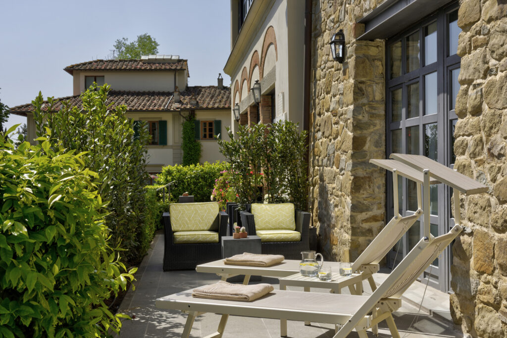
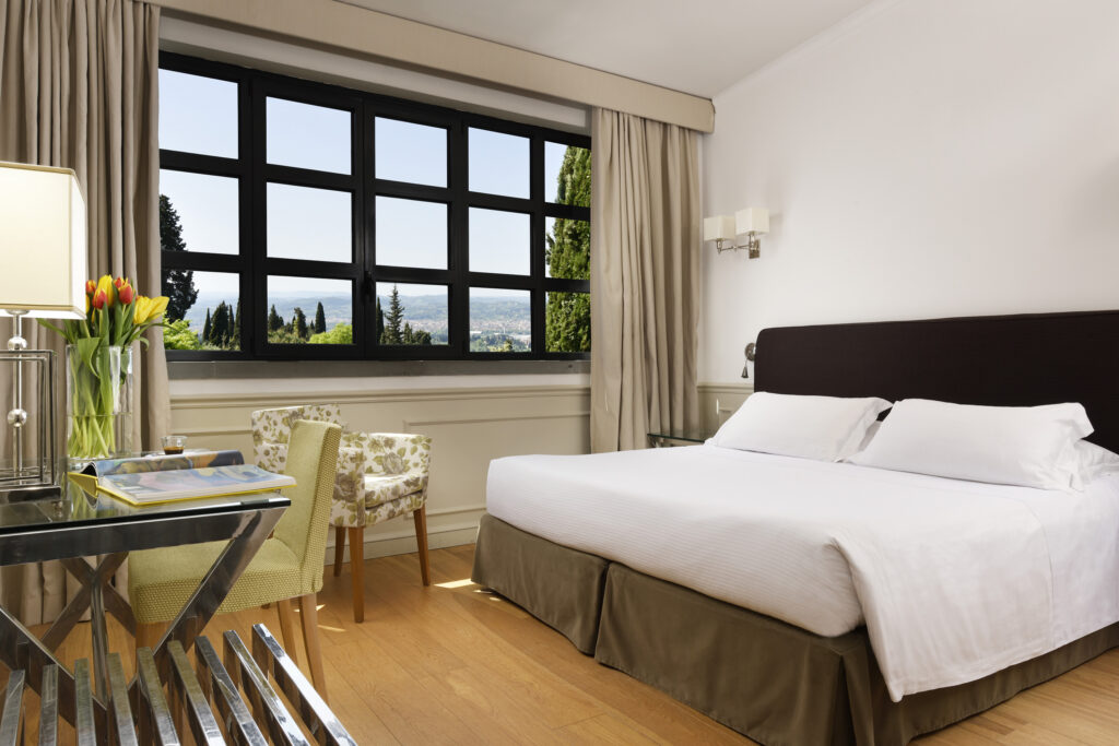
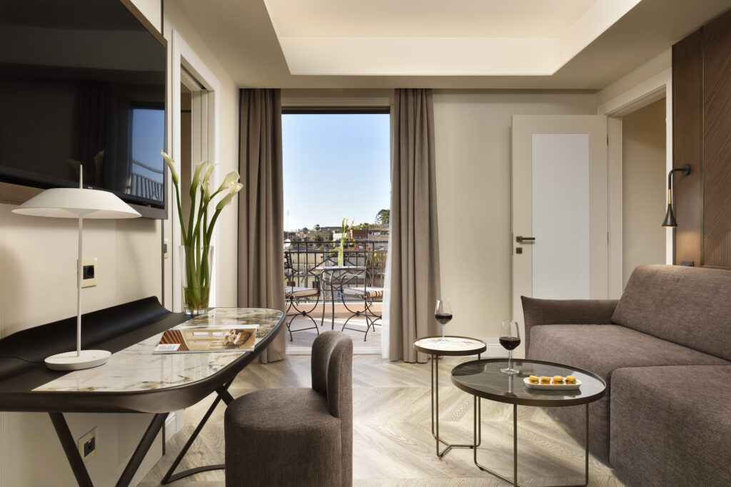
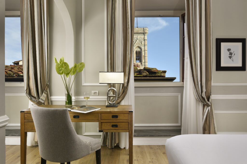
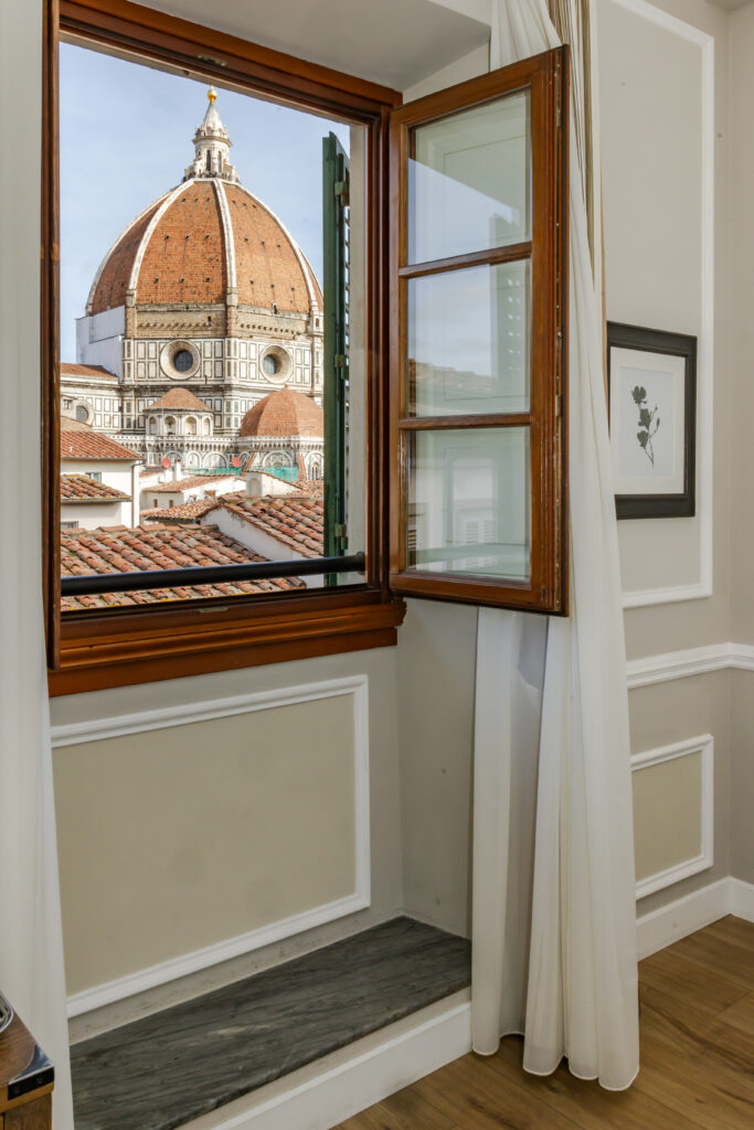
The group now describes itself as a collection of luxury city hotels defined by what it calls “charming luxury”. The idea is luxury that is understated and approachable, closer to elegance, comfort and authenticity than to spectacle. The cities are part of the proposition too. Each hotel occupies a historic setting and is designed to give guests a privileged view of Florence, Rome or Fiesole and what those places hold.
The positioning fits a wider shift in how seasoned travellers judge a hotel. The most discerning guests are less impressed by marble and gilt than by being known and looked after. South African travellers, raised on the personal service of the country’s best lodges and boutique hotels, will recognise the instinct straight away.
Catani is clear about where the group’s distinctiveness lies. FH55 has chosen “to highlight what makes us recognizable”, pointing to “our history, our locations, and our attention to people and to our guests”, and to pair those elements “with a contemporary language and an increasingly international vision of luxury.”
A Palette Drawn From Place
The new visual identity is where the change is most immediately visible. The FH55 logo becomes the group’s main mark, supported by a graphic system designed to keep every application consistent, from corporate communications to digital channels.
The colour story is deliberately restrained. FH55 Testa di Moro, a deep brown, is the primary brand colour, with FH55 Beige as its complementary tone. Individual properties bring accent colours in green, blue and terracotta, so each hotel can express itself without breaking the family resemblance. The typography follows the same logic: Ivy Presto, an elegant serif, is paired with the clean, contemporary lines of Futura Std, setting heritage against modernity.
The most characterful detail is the pictogram. Each hotel now has its own, inspired by the culture or geography of its destination. It is a small visual signature, but it does a lot of work, telling guests that the Roman address and the Tuscan hillside villa belong to one family without pretending they are the same house.
What Sits Beneath the Surface
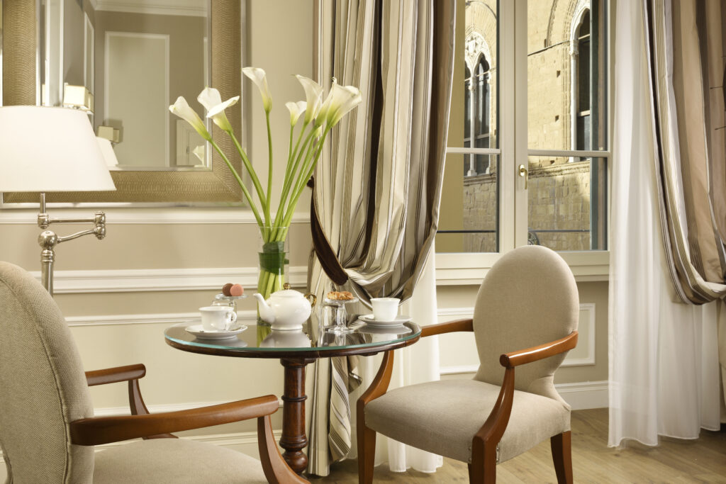
A new identity is only convincing if the experience matches it, and FH55 is presenting the rebrand as part of a broader programme of growth and property renovation. Its stated ambition is a refined, personal stay where contemporary luxury feels like home, through thoughtful design, comfort, tailored service and serious attention to food.
Five pillars guide this next phase: tradition and roots, excellence and quality, functional elegance, responsible innovation and integrated sustainability. The last has substance behind it. Since November 2023, surplus items from the breakfast buffet at the Grand Hotel Mediterraneo have gone to the Little Sisters of the Poor in Florence, an institute that is home to more than 70 elderly residents, along with 10 nuns and 20 staff. A project designed to reduce food waste now gives residents a full breakfast every day, and it is only the latest in a long line of charitable work by the group.
The Discipline of Restraint
The most persuasive thing about the FH55 rebrand is its restraint. The group has not tried to become something new. It has worked out how to describe what it already is, and has given that description a sharper, more coherent form. The group’s own view is that luxury is measured less by what a guest sees than by how a stay feels. A palette and a typeface can be commissioned in months, but the confidence to change so little of substance comes only from having spent seventy years getting the substance right.


Related Articles

Moët & Chandon and the Art of the Occasion: Champagne Day Comes to South Africa
From Friday 23 to Sunday 25 October, Moët & Chandon…
Weylandts Pulls Up a Chair at The With, Its First Bar, for Design Week
For more than sixty years, Weylandts furniture has lived in…
Porsche Mission S: The Return of Restraint
Porsche has unveiled the Mission S, a vision model that…

