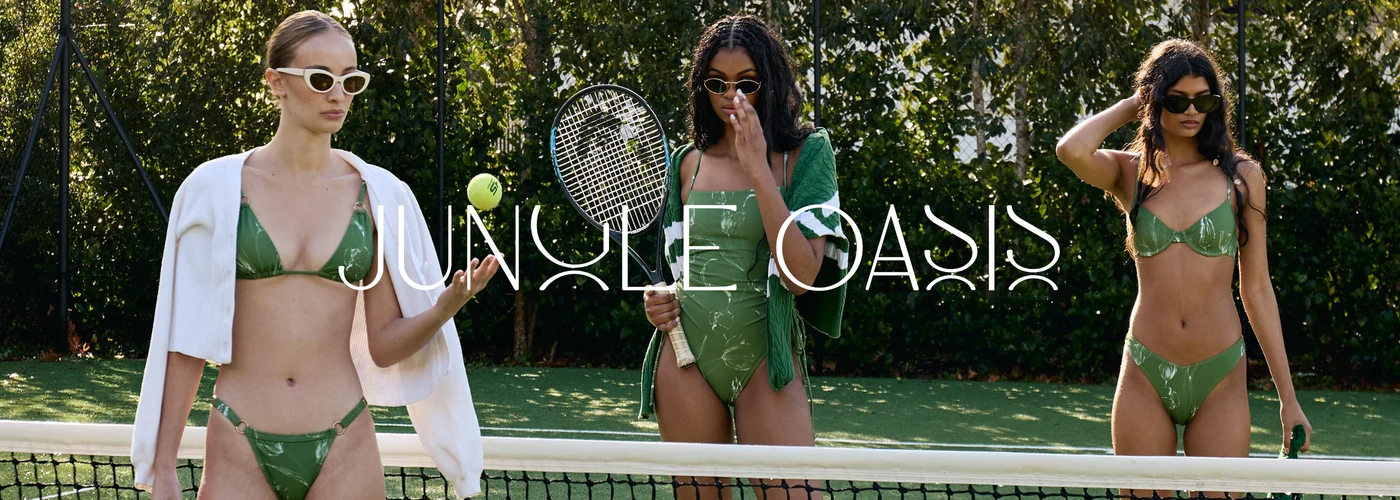
The second chapter of the BeachCult Jungle Oasis collection sets bold monochrome graphics against deep jewel greens and an untamed animal spot. The result is a wardrobe for long days at the water and warm nights after it. For a Cape Town label that has built its name on artist led prints and local production, the release also shows how a South African resort wear house tells a season as a story, one instalment at a time.
The Season Arrives in Instalments
BeachCult’s Jungle Oasis has no intention of revealing itself all at once. The Cape Town label has chosen to release its summer collection in chapters, and the second one, now open for pre order, takes a sharp turn away from the expected softness of holiday dressing. Here summer comes as a study in contrast: ivory against black, graphic line against organic texture, the cool restraint of monochrome set beside the depth of a rich green.
Releasing a season in chapters is an editorial choice as much as a commercial one. It gives each set of prints room to be seen, and it invites the customer to follow the collection as it unfolds. Instead of facing a single overwhelming drop, she meets a few distinct ideas at a time.
Sunwave and Moonwave, Two Sides of the Same Tide
At the centre of Chapter Two sit Sunwave and Moonwave, a pair of prints that work like a conversation. Both draw on graphic wave motifs broken by textural sunburst details, rendered in ivory and black. The effect is crisp and confident, closer to a gallery print than a beach pattern, and it gives the pieces a sense of occasion that carries well beyond the sand.
The silhouettes let the print lead. Moonwave’s Corsica Pants fall long and fluid, and in the campaign they’re styled with a matching shirt for a head to toe look that reads as relaxed tailoring. Sunwave’s Boyfriend Shirt is cut generously, made to be thrown over swimwear by day or knotted and worn open with wide trousers in the evening. A tied bandeau in the same print finishes the look, more Mediterranean terrace than poolside lounger.
Green, in Two Very Different Moods
If the monochrome prints set the tone, the greens give the chapter its heat. Emerald is exactly what its name promises: a rich, jewel toned colour with the kind of saturation that looks deliberate against sun browned skin and white linen alike.
Fauve is the wilder of the two. An earthy green scattered with organic black spots, it nods to animal print without leaning on the obvious. Its name, borrowed from the French word for wild beast, suits it. On the Daphne Bikini Top and across the wider Fauve offering of swimwear, dresses and palazzo pants, the print feels instinctive and slightly untamed, a welcome counterpoint to the precision of Sunwave and Moonwave.
A Cape Town Label With an Artist’s Eye
That tension between control and instinct runs through BeachCult as a whole. Founded and designed in Cape Town, the label works with prints created by local artists, and it produces its swim and resortwear ethically in South Africa. In a category often dominated by international names and anonymous mass production, that combination carries real weight. The prints have authorship, the garments have provenance, and the clothes speak to a particular way of living along the South African coastline.
It is also a label that understands how its customer actually dresses. The pieces in Chapter Two are made to move between settings: a swimsuit that becomes a bodysuit under trousers, a shirt that doubles as a cover up, a printed pant that goes from a Clifton afternoon to dinner in town without a change of plan. Resortwear in this sense is less about the holiday and more about a season of living outdoors.
Why Contrast Feels Right for Now
There is something timely in a collection built on opposites. Summer dressing has drifted towards soft neutrals and easy minimalism for several seasons. Chapter Two answers with graphic conviction and colour that holds its own. The ivory and black pieces feel architectural and modern, while Emerald and Fauve bring warmth, depth and a little drama.
For the South African woman who spends December between the coast, the bushveld and the city, that range matters. It offers a wardrobe with real personality, made locally and designed with the same care for print and proportion found in the best resort labels abroad.
A Summer That Refuses to Settle
Chapter Two works because it refuses to settle on a single idea of summer. Sun and moon, line and spot, monochrome and green: each print pulls in a different direction, and together they sketch a season that is bright by day and composed by night. If Jungle Oasis is a story told in instalments, this second chapter is the one where the plot thickens. It also makes a quietly persuasive case that some of the most considered resortwear on the market is being made right here, on the Cape coast.


Related Articles

ZENITH and USM Hold Up a Mirror to the DEFY Chronograph
ZENITH and USM Modular Furniture have returned to the partnership…
Mic Mann: Asking Africa to Think Beyond Tomorrow
The future rarely arrives with a polite knock. Sometimes it…
Reflections: Gert-Johan Coetzee Closes South African Fashion Week by Looking Back
Gert-Johan Coetzee closed South African Fashion Week AW27 with Reflections,…